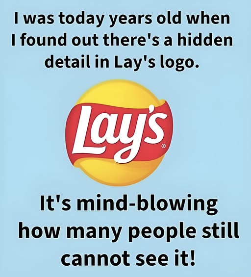
Everyone recognizes the Lay’s logo — the bold red ribbon, the golden-yellow circle, and that familiar name in the middle. It’s bright, inviting, and instantly makes you think of crispy potato chips. But what many people don’t realize is that this cheerful design hides a subtle detail that connects directly to the brand’s long history….